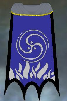
Serberus' suggestion:
MS's suggestion:

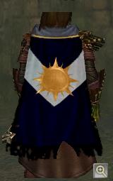
Current Cape:

Moderator: Global Moderators

Press Prt Scr, paste into an image editing program like Photoshop, crop it, save, upload to the web.Serberus wrote:as you have probably fuigured i havnt figured out how to get pictures from the cape creator lol)

I like this design due the the fact that its pretty cut and dry and it doesn't look too horrible. But I also like the little swirly pattern from the first cape too.SSX-MS wrote:
Press Prt Scr, paste into an image editing program like Photoshop, crop it, save, upload to the web.Serberus wrote:as you have probably fuigured i havnt figured out how to get pictures from the cape creator lol)


I don't agree with your reasons on the tattered bit, but I can live without it so it's moot.Inquisitor wrote:For the record, I REALLY dislike the tattered capes.
I'm more than willing to go with Serb's design if we can drop the tattered part. Is that a compromise we can live with? I'm kinda tired of talking about it
It's important for people not to be annoyed everytime they play the game, and Serb's suggestion (tattered notwithstanding) doesn't annoy me, while the current one clearly annoys some.
What does the cape look like with Serb's sun and darker blue, but with the lightning bolt instead of the chevron, and non-tattered?
Regarding why I think it's good to be unique: It's marketing and advertising. If you have a logo people remember, they're more likley to associate their experience with you (which was hopefully good) to anyone with that emblem. Visual reinforcement of the "SSX" tag. It's also really nice to be able to look in a sea of capes and say "there's one of ours!"
It makes me happy to be not like others, especially when the others are foul mouthed, foul tempered children