Page 1 of 2
Cape suggestion
Posted: Tue May 03, 2005 5:16 pm
by Inquisitor
Inquisitor's original suggestion
Serberus' suggestion:
MS's suggestion:

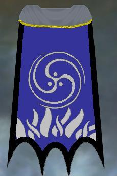
Current Cape:

Posted: Tue May 03, 2005 5:54 pm
by winbrian
I'm working on it.
Posted: Wed May 04, 2005 1:43 am
by Serberus
Ive seen a lot of capes around but can you get longer ones o vary the length of them? Cos i recon a full cape would be so much cooler

But that design isnt bad its a shame we cant import guild images so we can have the guild symbol. Then again if you could do that people would be putting porn on their banners etc (CSS style).
I think if the cape were a darker blue itd be cool or try it with black background with middle bit blue (if you can that is)
Posted: Wed May 04, 2005 12:34 pm
by Serberus
For the cape maker make that same cape but go over 1 on cape design thats quite a nice look. For colour go over about 4 for a darker blue to suit forums.
As for the emblem go over bout 17 till you get to a spikey ball (star) thats pretty cool with one of the ^ designs in background. and 2 more over is a less detailed swirl which could be nice. In general though im not fan of the cape designs other than just leaving it plain with a logo.
(as you have probably fuigured i havnt figured out how to get pictures from the cape creator lol)
Posted: Wed May 04, 2005 12:49 pm
by Inquisitor
On the software I was using, that was a darker blue...
You mean the 3 armed star design?
I am cool with that too.
Posted: Wed May 04, 2005 2:03 pm
by M.Steiner
Serberus wrote:as you have probably fuigured i havnt figured out how to get pictures from the cape creator lol)
Press Prt Scr, paste into an image editing program like Photoshop, crop it, save, upload to the web.

Posted: Wed May 04, 2005 3:19 pm
by winbrian
Ok here is the different ones. Note really big.
http://www.shatteredstar.org/ssx/groups ... ldcape.php
Pictures will remain there until we pick one.
Posted: Wed May 04, 2005 7:47 pm
by Inquisitor
If I were able to, I would buy the one that MS posted.
There's a reason I don't do layout and art for a living...
I like that one alot.
Posted: Wed May 04, 2005 8:08 pm
by Fenavian
SSX-MS wrote:
Serberus wrote:as you have probably fuigured i havnt figured out how to get pictures from the cape creator lol)
Press Prt Scr, paste into an image editing program like Photoshop, crop it, save, upload to the web.
I like this design due the the fact that its pretty cut and dry and it doesn't look too horrible. But I also like the little swirly pattern from the first cape too.
Posted: Thu May 05, 2005 2:21 am
by Inquisitor
I like MS's better than mine. Hands down.
Lets get that one, cause I REALLY want a cape

Lets make a poll and do this.
Posted: Fri May 06, 2005 3:32 pm
by Inquisitor
Updated. Lets take our time and be sure this time, 2k isn't a huge sum, but it's not trivial either
I prefer th clean capes to the tattered ones. Tattered ones make me think evil/bad, and that's not my preference. I also like our current one, so take anything I have to say with a grain of salt.
ok, done yammering. If you have an opinion, go to the guild emblemer in game or the cape creator and offer them. Or pick the emblems, cape styles, etc, from the page winbrian created.
Posted: Fri May 06, 2005 8:26 pm
by Fenavian
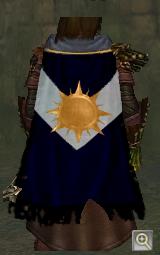
I really like Serebus's Cape. I mean.. Wow. That's nice.
As for the tattered look... Its more of a philosphical thing. To me it represents experience and the hard battles we fought to get to where we are. That's just me though. But I am also evil too so I guess thats a bonus for me ;p
I am not sure how to even make a cape so I am kinda stuck here.
Posted: Fri May 06, 2005 10:22 pm
by Inquisitor
Go to the guild emblemer in Ascalon City and ask about banners/capes, it will pop up a dialog
Posted: Sat May 07, 2005 7:55 pm
by Fenavian
here are a few of my suggestions.
I like the one on the far right myself. We are like a phoenix rising out of the ashes so to speak.

Posted: Sat May 07, 2005 11:51 pm
by Inquisitor
The problem I have wit the emblem on the far right is EVERYONE has them. I have also seen alot of the emblems I chose, and the simialr 3 armed ones. I thin kI want one that is different from others. as you walk around in the 10-15's, look at other capes. Let's go for something that doesn't look like every other internet asshole

I like serberus' option the best out of the alternatives so far. And I still, personally, don;t like it as much as what we have. Next time i am near an emblemer I will try recreatingwhat we have, without hte "kiddie" gold stars. See if thta is palatable to folks.
That being said, about halfway to 2k, so if we settle on a new design, it's almost affordable. I didn't contribute to the first one, so I feel compelled to make up for that.
Regarding the design: We're risen from the ashes, in my opinion, not rising. Putting to much weight on past events is likely to perpetuate bad feelings. I'd rather focus on things we ARE, rather on things we WERE. I also prefer not to live in the shadow of people who didn't do anythign to earn that kind of homage other than be distasteful
We ARE new. I think we ARE improved. Look to the future. It seems impressive
/soapboax
Posted: Sun May 08, 2005 12:14 am
by Fenavian
Fair enough I ill keep that in mind on the next batch.
Posted: Sun May 08, 2005 2:50 am
by Serberus
I tried to make the cape as close to what we wanted as possible.
I just wanted to say that the reason i made it like it is, is cos it apeals to the most people (i hope). It is tattered yet it looks clean and nice, the colour is similar to the forums albeit a lot darker.
The actual design and emblem well.. i tried to get the whole star thing going which is easy enough using the emblem i did. The shattered part...thats not so easy to keep it looking clean i used the v shape.
This is where i though rather than shattered id go for the exiles thing. Its nice clean cape that would be something that the "shattered satr would use" but as exiles time has had its way with the cape (tattered).
There is also one very nice thing about it. Ive not seen it anywhere whatsoever. Ive seen similar designs to our current one. So this would be individual i suppose....for a while.
Posted: Mon May 09, 2005 9:54 am
by firedancer
here, are two pictures, of a bit unconvenitional capes, but which could look also quite nice. the first one, can also be simpler without the mountain in the middle and just the little structure at the bottom, and the rest in grey.

Posted: Thu May 12, 2005 11:48 pm
by Syn
It may be slightly late for this, but here are my ideas.

To me the star is more similar to the Shattered Star, but if you guys want the 3 stars its fine with me. The colors are pretty standard SSX, blue, silver, green, the tattered cape since several people expressed a liking for it. And either lightning bolt or cheveron. To me it looks nice, isn't something that looks particularly embarrassing and goes well with us, as us.
BTW, my play time is getting cut, durasticaly, so consider my growth stumped here for a while.
Posted: Fri May 13, 2005 3:41 am
by Fenavian
The green doesn't fit well I dont' think.
Posted: Sat May 14, 2005 6:16 pm
by Inquisitor
For the record, I REALLY dislike the tattered capes.
I'm more than willing to go with Serb's design if we can drop the tattered part. Is that a compromise we can live with? I'm kinda tired of talking about it
It's important for people not to be annoyed everytime they play the game, and Serb's suggestion (tattered notwithstanding) doesn't annoy me, while the current one clearly annoys some.
What does the cape look like with Serb's sun and darker blue, but with the lightning bolt instead of the chevron, and non-tattered?
Regarding why I think it's good to be unique: It's marketing and advertising. If you have a logo people remember, they're more likley to associate their experience with you (which was hopefully good) to anyone with that emblem. Visual reinforcement of the "SSX" tag. It's also really nice to be able to look in a sea of capes and say "there's one of ours!"
It makes me happy to be not like others, especially when the others are foul mouthed, foul tempered children
Posted: Sat May 14, 2005 8:37 pm
by Fenavian
Welp I decided to be a bit unorthodox. While we are "Shattered Stars", who says that it has to be our emblem persay. So here are some more of my designs.

Posted: Sat May 14, 2005 9:58 pm
by Fenavian
Inquisitor wrote:For the record, I REALLY dislike the tattered capes.
I'm more than willing to go with Serb's design if we can drop the tattered part. Is that a compromise we can live with? I'm kinda tired of talking about it
It's important for people not to be annoyed everytime they play the game, and Serb's suggestion (tattered notwithstanding) doesn't annoy me, while the current one clearly annoys some.
What does the cape look like with Serb's sun and darker blue, but with the lightning bolt instead of the chevron, and non-tattered?
Regarding why I think it's good to be unique: It's marketing and advertising. If you have a logo people remember, they're more likley to associate their experience with you (which was hopefully good) to anyone with that emblem. Visual reinforcement of the "SSX" tag. It's also really nice to be able to look in a sea of capes and say "there's one of ours!"
I don't agree with your reasons on the tattered bit, but I can live without it so it's moot.
I also agree that we need to put this to rest and soon
It makes me happy to be not like others, especially when the others are foul mouthed, foul tempered children


:whistles innocently:
Posted: Sat May 14, 2005 10:41 pm
by Inquisitor
You don;t like "kiddie", I don't much care for "street beggar"
I think I like Serb's best of hte alternatives so far.
Posted: Sun May 15, 2005 10:18 am
by Serberus
Guys stop bitching, ulitmatley we almost need to make a new cape as for your ideas of changing colours for the cape ive tried it doesnt look to specy. Ive playerd around a bit and there are other background designs that look really cool.
However i think that (personaly) the tattered capes look cool but i must admit most of them are pretty average looking the one i put on my design is the only one thats nice being still square and not rags as some look. The normal capes are alright but i think that we should try to go for a normal cape look rather than the spikey bottomed ones.
Ultimatley leave it to the guild vote whatever we do this guild seems firmly devided lol. Its frustrating but its life we wil go with what the guild votes. (even if i dont disagree with it
)